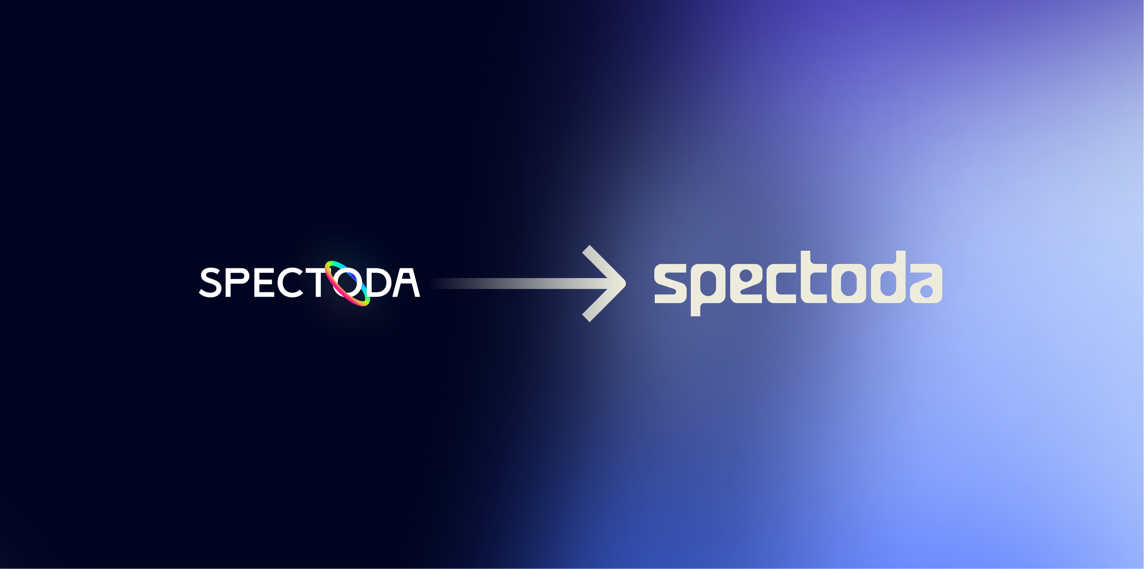
Spectoda is gradually evolving, and with that, the time has naturally come to adjust the way the brand presents itself to the outside world. The new visual identity is not a sudden change, but a logical step that reflects Spectoda's shift in recent years.
From its origins as a stage tool, Spectoda has evolved into a universal system for light control in architecture, industry, and public spaces. This is reflected in the new visual style, which is calmer, more legible, and designed with an emphasis on long-term sustainability.
Why we decided to change
We repeatedly encountered the fact that Spectoda was perceived primarily as a solution for digital LED strips and effect installations. This impression was partly supported by the original visual identity with its distinctive colored ring.
Today, Spectoda is a much broader platform. It is based on a decentralized system that handles architectural and office lighting, industrial DALI installations, biodynamic lighting, neon pixel LED strips, and stage lighting.
The new visual style is designed to communicate this breadth naturally and without the need for further explanation.
A partner who understands light and architecture
We chose Rising Studio from Zlín for the rebranding based on their experience with architectural, lighting, and technical projects. From the outset, it was clear that this was not just about a new logo, but about a comprehensive identity that had to work in the long term and in various contexts.
Our task was to create an identity that would be timeless and minimalist, understandable across target groups, legible in marketing and technical outputs, and ready for further brand development.
An identity based on system principles
The basis of the new identity is typography in which all letters are on the same level. This principle refers to the decentralized nature of Spectoda, where individual elements work together without a central point.
The same approach is reflected in other graphic elements. Everything is based on one basic shape, just as the entire Spectoda ecosystem is based on one technological foundation.
Colors that promote trust
The color palette remains a combination of purple and blue, which have long been associated with reliability, stability, and technological sophistication. Subtle gradients bring light and movement to the identity and naturally refer to the medium Spectoda works with.
One identity for all outputs
We placed great emphasis on ensuring that the identity works not only in marketing, but also in technical materials, where clarity and readability are key.
The new visual system is therefore consistent across the website and presentations, datasheets and technical documentation, installation manuals and user interfaces.
Same Spectoda, clearer direction
The rebranding does not change the essence of Spectoda. It only helps to communicate it clearly and comprehensively.
When changing our visual identity, the trust of our business partners and customers is key for us. It is thanks to long-term cooperation, open dialogue, and joint projects that we can continue to develop Spectoda and move it in the right direction.
We would like to thank everyone who trusts us and works with Spectoda on a daily basis. We appreciate it and take it as a commitment to continue what we do reliably, in the long term, and with respect for the people and projects we are part of.